Monday, October 12, 2009

Art book classics


So I'd like to detail some art books (mostly about drawing) that are very near and dear to my heart. Some are rather difficult reads. So I make my appologies right here. However...IF you can wade through the language and set all this knowledge right in your brain, it WILL blow your mind. These are the goods right here fo shizzle. And so in no particular order....

A Treatise on Landscape painting by Andre Lhote

Painter's Progress by Maurice Grosser

The Art Spirit by Robert Henri

Figure Drawing for All it's worth by Andrew Loomis

The practice and science of drawing by Harold Speed

Oil Painting Techniques and materials by Harold Speed

Perspective for Artist by Rex Vicat Cole

The Artistic Anatomy of Trees by Rex Vicat Cole

Painting Techniques of the Masters by Hewerd Lester Cooke

Elements of Drawing by John Ruskin


more to come as I think of them...
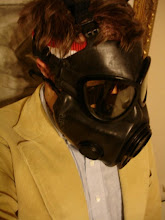
Tuesday, September 29, 2009


So I started reading this book last night. I knew that I always loved Dickens, but I forgot why. Well it didn't take but 3 pages and I was hooked. I think I've actually read this book before because little snippets come back to me as I read. I love this FN book!
So it may sound stupid, but I love the way the characters sit by the fire and talk. They notice the weather and all sorts of fine details. All at once Dickens creates a world that is both happy and sad. The way Dickens describes the characters and places are so vivid and real that I have a whole world in my mind. I even imagine the what the characters sound like. He is truly a master.

Thursday, September 24, 2009


Here it is. In all its glory. And it didn't kill me afterall.

Thursday, September 17, 2009

More stuffs part 2....


Here's some stuffs that are going into the Rock n Roll craft show 6. I got accepted. Woot! Woot! Now i just have to craft my ass off until the deadlines....
this is Pink Meanie and Laparotomy Rabbit. So cute. Upcycled stuffed animal from the goodwill and it doesn't even smell like a little kid!

new stuffs


Ok, it's been a long while since I've posted anything. Well, I've been really busy making a poster for Lola Van Ella's St. Louis Showcase. I'll post pics of that when I'm finished with it. It's been a 2 month endeavor so it should actually be better than it is, but whatever. Here's a sketch of the poster without all the colors. Also some stuff I've done in the meantime...

Sunday, May 17, 2009

Screen Printing for fun and profit...well fun.


Here is my first multi-color screen print. I think it's kind of busy. I might simplify this color scheme and take another stab at it. I'm happy with the drawing. I think it's pretty baddddassss.

Dr. Sketchy's May 09


More Dr. Sketchy's May.


Wednesday, April 1, 2009


This is a 15 minute pose. The models were awesome and so creative. This is Chris' new wednesday group. What a great session. 

Monday, March 30, 2009


This is a work in progress.  Another Artist Guild Thursday night life painting. I need to refine the face. It's looking way too big. 

Dr Sketchy's March 09

5 min
20 min
5 min 
10min
5min

Friday, March 27, 2009

Life painting March 09


I painted this at the Artist Guild's Thurday night session. It was a 3 hour pose. I used cobalt blue (cb) and burnt sienna (bs) tinted up with soft mixing white. I also created a neutral blue black by mixing the c.b. and b.s. together and tinted that up with white too. My initial block-in was with bs using the wipe out method to denote the lights. After I let it dry for a few days, I was irritated at how hot the whole thing was looking. So to cool the whole thing off, I mixed up some purple with cobalt blue and just a touch of permanent Alizarin Crimson. Then I greyed/neutralized it a bit with my cb/bs grey.
I seem to be in love with Burnt Sienna for some reason. I just love the look it has underneath a sketch. I should probably move on to some other colour or technique, but I just can't so far. I noticed that Steve Allrich (Oil Painting for the serious beginner) seems to be in love with cad yellow. His stuff does have this nice warm happy glow. I read somewhere that we all have our pet colours depending on how our eyes are so inclined. I guess my eyes like hot red/orange.
In terms of composition, I puposely put the figure way to the left. I was getting sick of putting the model smack in the middle all the time so I tried change it up for a more interesting compostition. I don't think it's completely successful. The model's right arm draws too much attention going out of the field. I also tried to counter balance the thing with that nebular box in the bottom right corner. It was actually a cushion. I think it balances, but there is definitely too much space the upper right quadrant. Makes for much boring-ness. My overall impression of this exercise is that it definetely has something, but it is still student grade work. Sloppy, unsuccessfully composed, poorly defined facial features, poorly selling fingers that look more like curled carrot sticks, big boring parts, and colour this is rather schizophrenic. All that said, I still like it though.